Why your prompts feel random (and fixable)
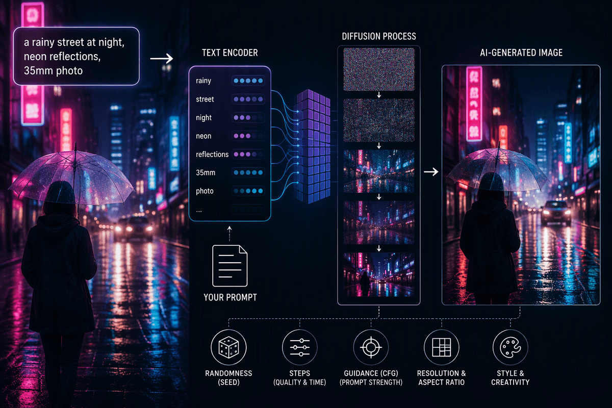
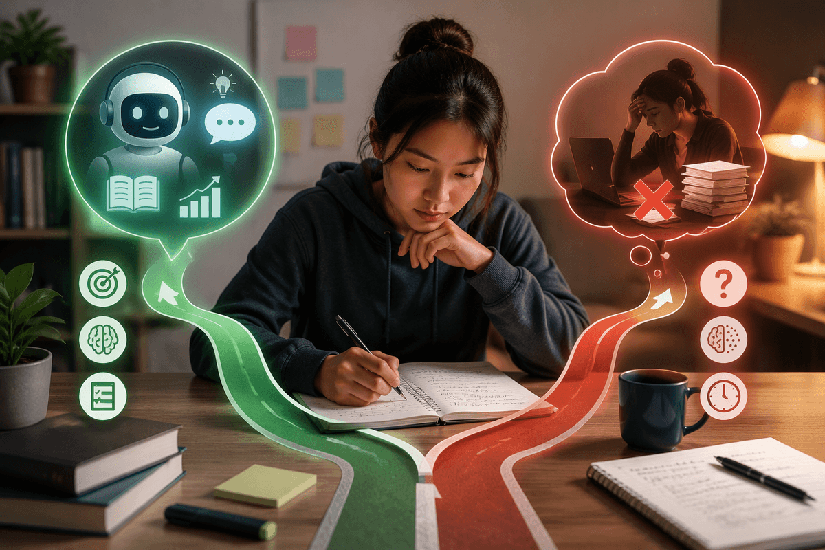
You type what seems like a clear prompt, hit generate, and get four images that look like they came from four different briefs. That “randomness” usually comes from underspecified decisions. If you don’t tell the model what matters most (the main subject, where it is, what it’s doing, and what success looks like), it fills gaps with defaults pulled from broad patterns. Style words can also conflict (“minimalist” plus “hyper-detailed”), and small terms can hijack the result (brand names, camera jargon, trendy aesthetics).
The fix is less about longer prompts and more about cleaner intent. Treat every prompt like a short creative brief: pick a primary goal, lock a few non-negotiables, and remove anything that doesn’t serve them. Expect a practical cost: more discipline up front and a couple of “boring” test runs. That trade buys you faster iteration because you’ll know what to change when outputs drift.
Start with the image job: subject, setting, goal
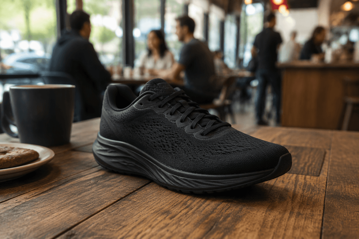
Requests such as “a modern product photo” leave too much room for interpretation. The model might produce a studio shot, a lifestyle scene, or a glossy 3D render, depending on how it reads the brief. To keep the result focused, define three things first: the subject, the setting, and the purpose. The subject is the main person, product, or object that should draw attention. The setting describes its surroundings, whether that means a white studio background, a busy café, a desert at dusk, or an app interface on a phone. The purpose establishes what the image needs to achieve, such as selling a product, explaining a feature, creating an aspirational mood, or remaining legible as an icon.
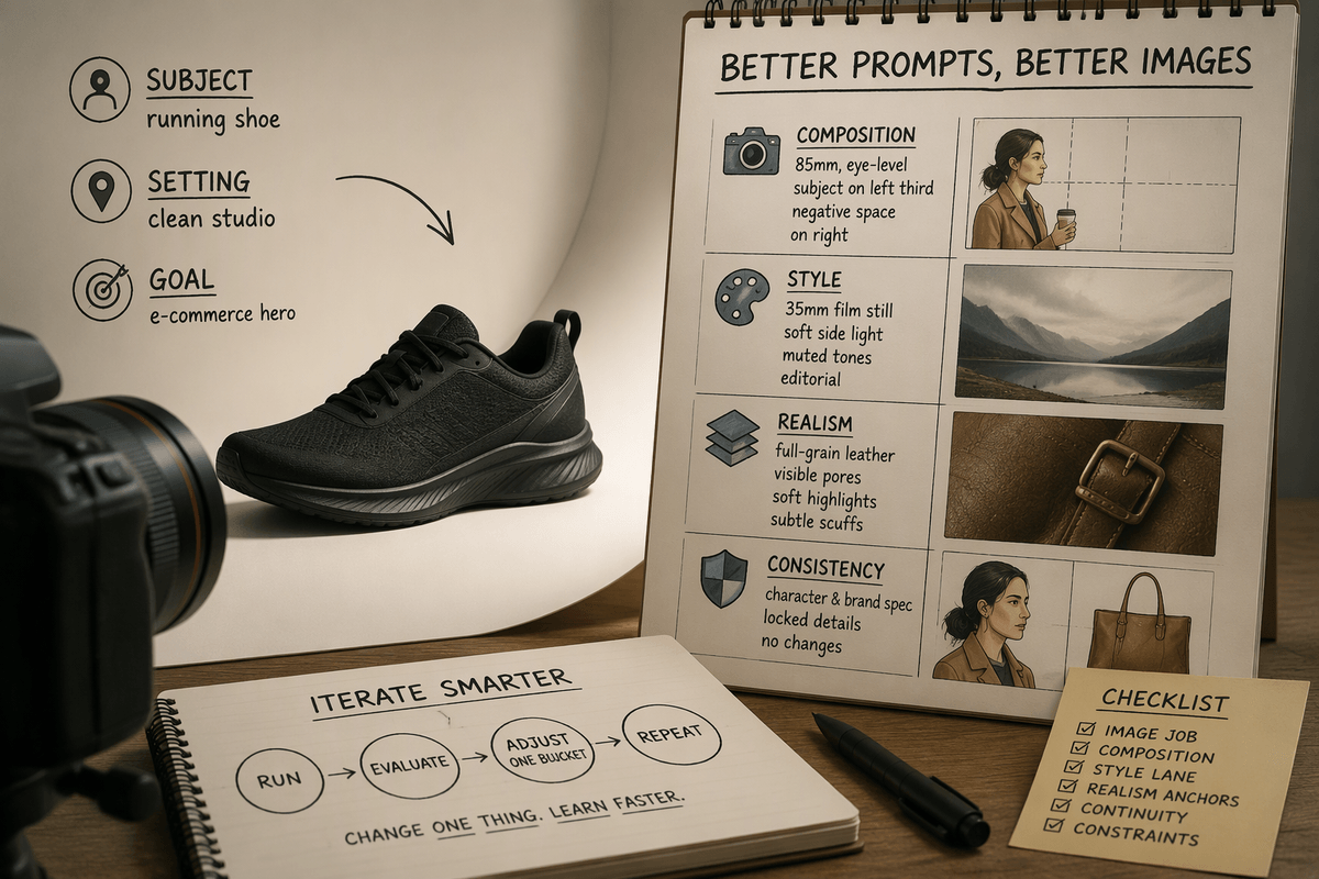
Write these decisions into one clear sentence before adding stylistic details. For example: “Single subject: matte black running shoe on a clean studio background; goal: e-commerce hero image with visible texture and accurate proportions.” Separating the core purpose from the visual style makes the brief easier to follow. When the goals conflict, such as dramatic lighting and precise color representation, separate prompts may produce better results than asking one image to satisfy both.
Control composition like a director: camera and framing
You’ve likely prompted “a person holding a coffee” and gotten anything from a full-body street scene to a tight crop of hands. That swing is mostly composition. Start calling the shot like a director: choose camera distance (wide, medium, close-up), angle (eye-level, low angle, top-down), and lens feel (wide-angle for environment, telephoto for flatter, product-friendly shapes). Then lock framing: centered vs. rule-of-thirds, headroom, negative space for copy, and whether the subject is looking into frame.
Keep it concrete. “Medium close-up, eye-level, 85mm portrait look, subject on left third, clean negative space on right for headline, shallow depth of field, background softly blurred.” If the model keeps changing the crop, add constraints like “no full body,” “hands fully in frame,” or “no extreme fisheye.” The tighter framing reduces flexibility for later layout changes, so save wide versions when you need room to crop.
Style without confusion: references, mediums, and mood
Prompts that combine terms such as “cinematic,” “minimalist,” “watercolor,” and “ultra-realistic” often produce inconsistent results because the styles pull the model in different directions. Choose one primary visual style and support it with two or three compatible cues. Descriptions such as “35mm film still” or “high-end studio product photo” establish a clearer visual direction. When working from reference images, specify the qualities worth retaining, such as soft side lighting, a muted palette, or editorial styling, rather than combining numerous artist names and hoping the model reconciles them.
Mood also becomes easier to control when it is described through visible details. Instead of relying on “premium,” specify a cool color temperature, low contrast, gentle shadows, and a quiet background. If the style starts to overwhelm the subject, move those instructions later in the prompt and add clear requirements such as a legible logo, accurate brand colors, or no painterly texture. Strong stylistic effects may distort realistic details, so creating one image for atmosphere and another for visual accuracy may work better than forcing both goals into a single prompt.
Make details stick: materials, textures, and realism
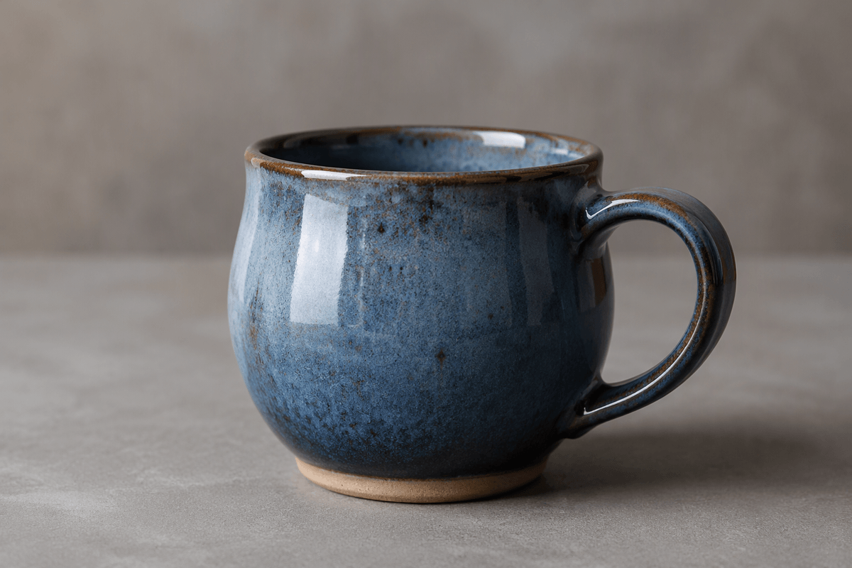
You’ve seen it when a “leather bag” turns into shiny plastic, or “ceramic mug” reads like matte stone. Models default to generic surfaces unless you tell them what the material is doing under light. Specify the material plus one physical behavior: “full-grain leather with visible pores and edge paint,” “brushed aluminum with fine linear grain,” “glazed ceramic with subtle specular highlights,” “knit cotton with pill texture.” Add age and condition if it matters: “slight scuffs on corners,” “new, dust-free,” “fingerprints on stainless steel.” These cues anchor realism more reliably than piling on “ultra-realistic.”
Then give the model a realism test it can’t dodge: what should be sharp, what should blur, and what imperfections are acceptable. “Micro-scratches only in highlights,” “seams aligned, stitching consistent,” “no melted edges, no warped logos, no extra fingers.” You’ll often need one extra iteration to tune texture strength so it doesn’t turn into noise or over-sharpened grit.
Get consistent characters and brands across runs
Repeated prompts may produce a noticeably different character each time, with changes to facial features, hairstyle, or accessories. A reusable character or brand specification helps keep those details consistent. Include concrete attributes such as age range, build, skin tone, hair color and cut, distinctive features like freckles or glasses, and a defined wardrobe. Add one or two rules that must never change. For product images, specify the exact color family, surface finish, logo placement, packaging shape, and defining proportions, such as a tall cap, rounded corners, or a wide toe box.
Fewer stylistic variables also make consistency easier to maintain. Limit broad adjectives and phrases such as “fashion-forward,” “trendy,” or “different outfit,” which invite unnecessary variation. Negative prompts can address recurring problems, including unwanted hats, jewelry, new patterns, altered logos, or extra text. Even with a detailed specification, extreme poses, dramatic lighting, and heavy stylization may distort familiar features. Establish the character’s or product’s appearance first, then introduce those effects once the visual identity is stable.
Iterate faster with a simple prompt checklist
You don’t need more adjectives; you need a repeatable loop. Before each run, scan a short checklist: (1) image job: subject, setting, goal; (2) composition: distance, angle, framing, negative space; (3) style lane: one medium plus 2–3 compatible cues; (4) realism anchors: materials, texture behavior, what’s sharp vs. blurred; (5) continuity block: the spec you will not change; (6) constraints: 3–6 “no” items that prevent the usual artifacts. Change one bucket at a time, keep the rest identical, and name versions. You’ll ignore tempting tweaks to isolate what actually worked.